Fountain pens are refillable writing instruments that feed liquid ink to a metal nib, and for many people the appeal is equal parts handwriting feel, engineering, and collecting. Even broad retail guides show how deep the field goes: beginner pens sit alongside names like Pilot, Pelikan, Montblanc, Parker, Sheaffer, Sailor, and limited or special editions, while everyday choices quickly branch into nib widths, cartridges, converters, and piston fillers. The culture is shaped by tactile details insiders obsess over — a smooth fine nib versus a springy gold nib, a clear demonstrator body, or the filling system hidden inside the barrel. What looks like a simple pen hobby turns into a world of ink behavior, vintage design, and fiercely personal preferences about how writing should feel.
Learn
How Fountain Pens Open Up: Nibs, Fillers, and Why Feel Matters
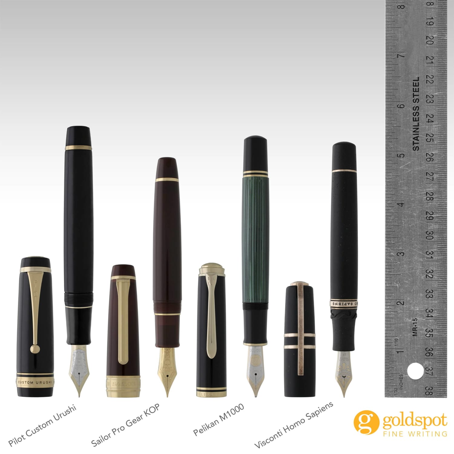
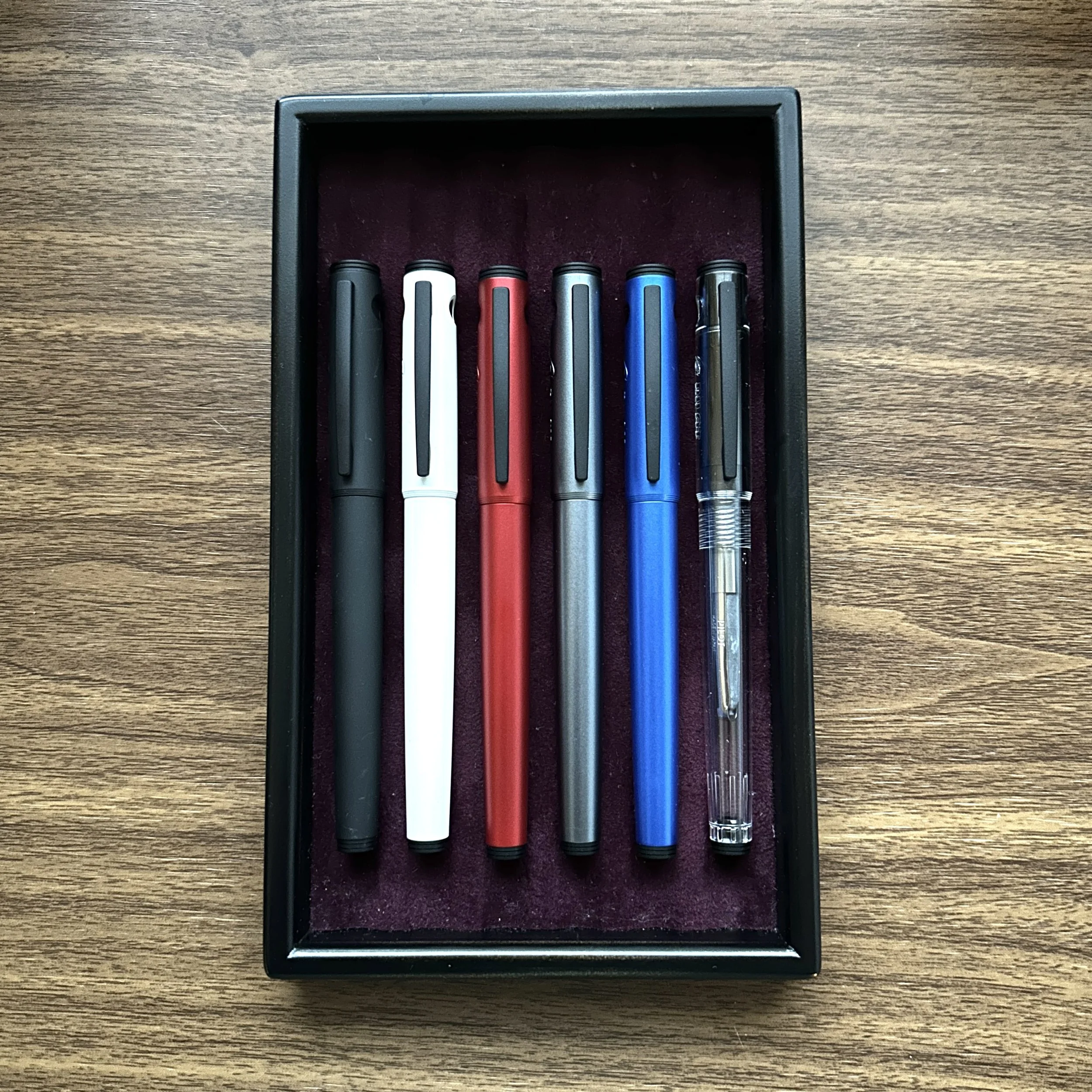
A fountain pen's personality emerges at the intersection of its nib and its filling system—the nib dictates how the tip meets paper (line width, smoothness, ink flow), while the filler determines how you reload that flow and how much ink you carry. The nib itself works by capillary action: a precise slit draws ink from the reservoir down to the tip, and the tines (the two halves of the slit) must rest evenly on the page at about a 45-degree angle for the ink to lay down properly. Nib sizes differ between Western and Japanese manufacturers—a Western fine writes broader than a Japanese fine, so a Kaweco Sport in fine will lay a thicker line than a Sailor Pro Gear Slim in fine. For filling, the Pilot Custom 74 with its CON-70 converter offers a high-capacity twist-piston converter that matches the convenience of cartridges with the ink-color freedom of bottles, while the Platinum Preppy's Slip and Seal cap keeps the nib moist for over a year, making it a worry-free entry point. The Pilot Metropolitan, often hailed as the gold standard beginner pen, pairs a smooth steel nib with a metal body and includes both a cartridge and a converter out of the box, proving that feel and functionality don't require a high price.
 gouletpens.comgouletpens.com
 gouletpens.comgouletpens.com
+Field notes
- —Nib sizes are not standardized: a Western fine (e.g., Kaweco Sport) writes significantly broader than a Japanese fine (e.g., Sailor Pro Gear Slim), so a Fine in one brand may feel like a Medium in another.
- —The Pilot Metropolitan redefined entry-level pens since 2012 by combining a smooth steel nib and a metal body with both a cartridge and a converter, allowing immediate use of bottled ink without extra cost.
- —The Platinum Preppy uses a Slip and Seal cap mechanism that prevents the nib from drying out for over a year, even if unused for weeks, making it a no-hassle choice for occasional writers.
- —The Pilot Custom 74's compatibility with the CON-70 converter—a high-capacity twist-piston converter—makes it a favorite among cartridge/converter pens because it offers the ink capacity of a piston filler without sacrificing the option of quick-swap cartridges.
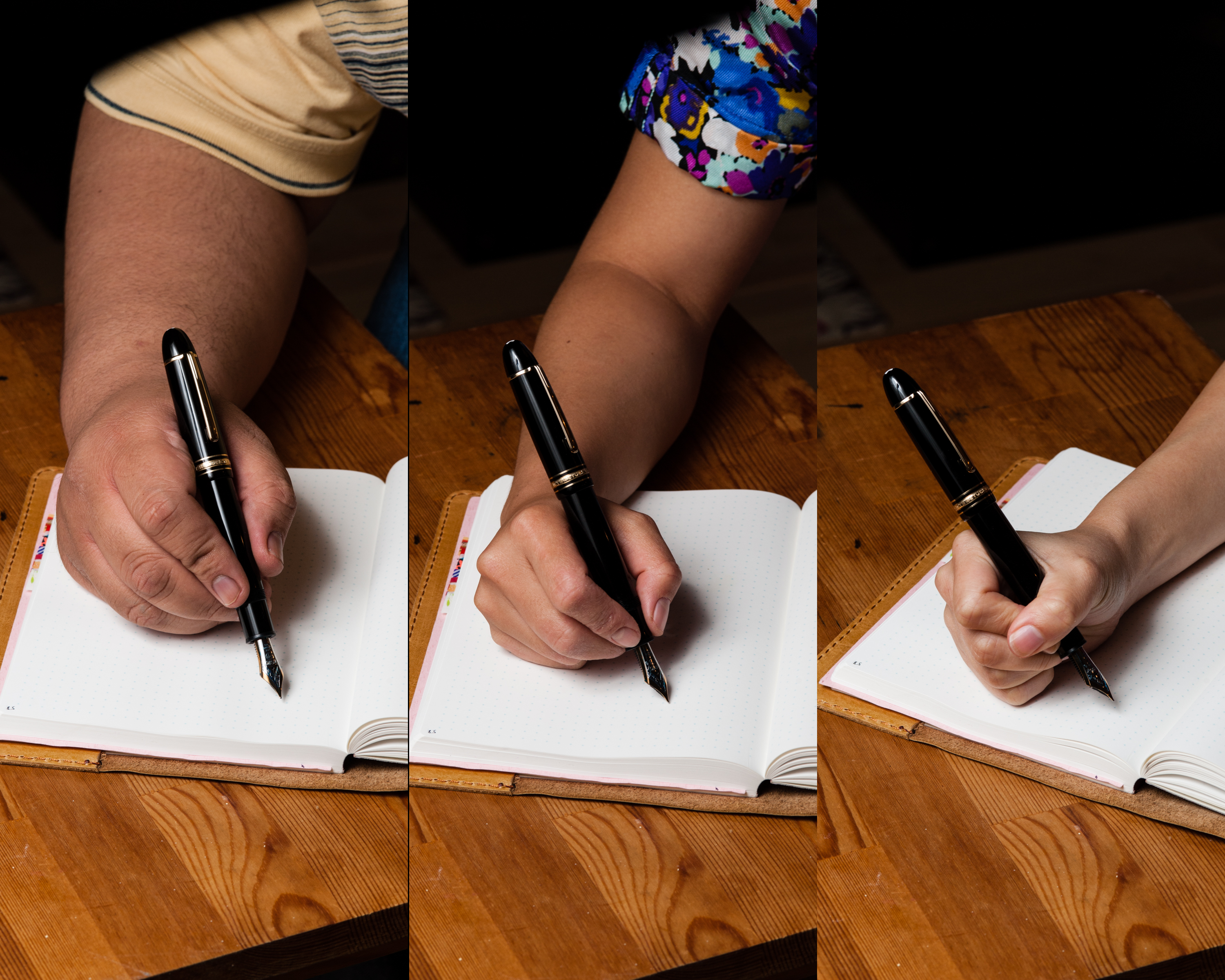
- —To write properly with a fountain pen, hold the nib at about a 45-degree angle to the paper with the tines resting evenly—this ensures the slit delivers ink via capillary action rather than gravity alone.
Learn
From Hard Rubber to Meisterstücks: The Shapes Collectors Still Recognize
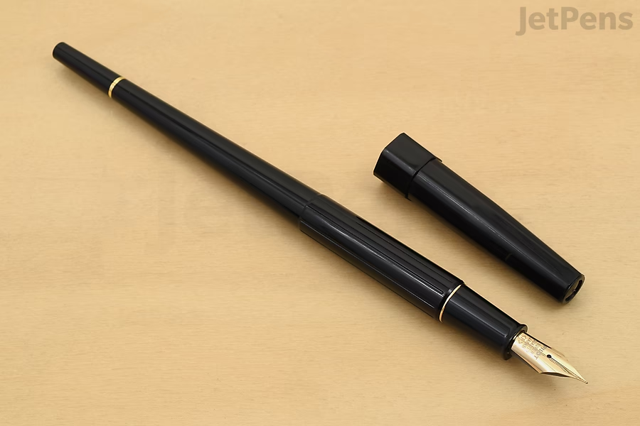
The fountain pens that collectors most revere today weren't just writing tools—they were material breakthroughs that rewrote what a pen could be. In 1921, Lewis M. Tebbel at Parker gambled on a bold Chinese-red hard rubber pen called the Duofold, priced at a staggering $7.00 (about $126 today), and insisted on smooth barrels instead of the chased patterns then in fashion. That flash of red—advertised as rivaling a scarlet tanager—was a radical departure from staid black, and the Duofold's shape (originally a flat-top, later streamlined with tapered ends in 1930) set a visual template for decades. Meanwhile, across the Atlantic, Montblanc's Meisterstück emerged in 1924 from requests for refined Sunday-use pens, but its defining form—the cigar-shaped silhouette—didn't crystallize until 1949 with the introduction of the model 149. That pen, with its three-tone 14K nib and iconic proportions, became the archetype of the luxury fountain pen, surviving even the jet-age detour of the 1960s Linie 60. The real collector's insight lies in the materials: before celluloid brought jade greens, lapis blues, and pearlescent patterns in the late 1920s, pens were trapped in the dark palette of hard rubber. Sheaffer's Jade Radite and Parker's Black Tipped Jade Duofold were the first to prove that a pen could be both a precision instrument and a dazzling object of desire. The Pelikan 1000, Parker Duofold Centennial, and Montblanc 149 remain the shapes collectors still chase—each a frozen moment in the evolution from utilitarian tool to emblem of craftsmanship.

 montblanc.commontblanc.com
 fprevolutionusa.comfprevolutionusa.com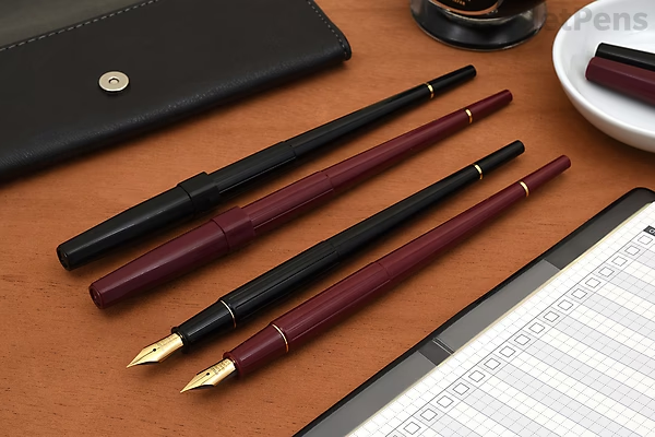
+Field notes
- —The 1921 Parker Duofold was consciously designed without chasing (surface engraving) on its barrel and cap, a deliberate break from period fashion that made its bright red hard rubber finish stand out even more—Tebbel insisted on a smooth, plain surface.
- —Parker's 'Permanite' was its trade name for DuPont-manufactured plastic, and the first new color was red, followed by Jade green—but that jade was initially sold as 'Black Tipped Jade' and wasn't even called a Duofold at launch, because it directly competed with Sheaffer's revolutionary Jade Radite.
- —Montblanc's Meisterstück 149, introduced in 1949, was the pen that solidified the cigar shape as the brand's signature—but just a decade earlier, in the 1930s, its predecessor had a different cylindrical silhouette with a single broad cap ring and bolder clip, showing how the design evolved from a utilitarian look to the iconic streamlined form.
- —Celluloid's peak era in pens was the 1920s to 1940s, but it was highly flammable and prone to discoloration and brittleness over time—which is why later plastics like cellulose acetate and acrylic replaced it, and why surviving celluloid pens in vibrant jade or lapis lazuli hues are so prized by collectors.
- —The Montblanc 149's nib carries the engraving '4810'—the height of Mont Blanc in meters—a detail that came from an early marketing idea that the pen should be the 'pinnacle of quality,' just as the mountain is the tallest peak in Europe.
- —Pelikan entered the fountain pen market late in 1929 but revolutionized it with the first piston filler—a system that was far cleaner and more reliable than eyedropper-fillers, and the early models (like the '1st year pen' in jade) are now intensely collected artifacts of German modernist design.
Learn
The Vocabulary People Actually Use: Flex, Stub, Feedback, Wetness, Demonstrator
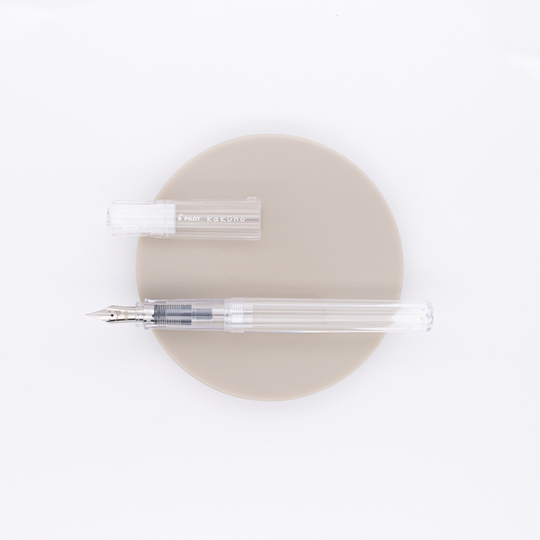
In the fountain pen world, the vocabulary goes far beyond basic nib sizes—it's a language that describes how a pen actually feels and behaves. A flex nib, like the legendary vintage Mabie Todd Swan 14k flexible nibs, creates line variation by spreading its tines under pressure, with the most extreme examples known among collectors as 'wet noodles'; modern 'soft' nibs offer only a cushioned feel and slight line width change, not true flex. Stub nibs, by contrast, produce line variation through their squared-off tip shape—cut straight across—and come in a spectrum from crisp italic (chiseled, sharp line variation) to cursive italic (slightly softened) to stub (smoothest, least line variation), with specialty grinds like the 'DailyItalic' aiming to retain most of the line variation of a cursive italic while approaching the smoothness of a stub. Feedback—the tactile resistance of the nib on paper—is a matter of personal taste; an over-polished nib can develop 'baby's bottom,' a condition where the tipping is so rounded that the pen skips and hard-starts, while a nib with just the right amount of feedback gives controlled, pleasant writing. Wetness refers to how much ink the pen lays down, and it dramatically affects ink properties: a wet writer can make even a dry ink look saturated, while a dry pen can tame a wet ink and reduce feathering on poor paper. And the term 'demonstrator' originally meant a pen made of clear material—like Sheaffer's 1920s cutaway lever-filling demonstrator or Parker's 1948 '51' clear Vacumatic—for dealers to show internal workings, though today almost any transparent pen sold to the public is casually called a demonstrator.

 provincialpenco.comprovincialpenco.com
 gouletpens.comgouletpens.com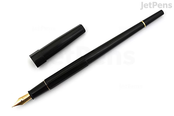
 jetpens.comjetpens.com
+Field notes
- —Flex nibs from the vintage era (e.g., Mabie Todd Swan 14k gold flexible nibs) are far more flexible than any modern 'soft' nib; the most extreme vintage flexes are called 'wet noodles' by collectors, capable of producing line widths about six times greater than a standard nib. Modern nibs labeled 'flex' or 'soft' typically only offer a cushioned feel and minor line variation, not true Spencerian-level flexibility.
- —Stub nibs cut the tip straight across to create broad downstrokes and thin sidestrokes, but they exist on a grind spectrum: crisp italic (sharpest line variation, but scratchy), cursive italic (slightly softened edges), and stub (smoothest, most rounded, least line variation). The 'DailyItalic' grind by Linda Kennedy sits between cursive italic and stub, offering a smooth feel while retaining most of the line variation of a cursive italic.
- —'Baby's bottom' is a common nib defect where the tipping material is over-polished into a rounded shape (like a baby's backside), causing the nib to skip and fail to start writing; it's the opposite of desirable feedback—a controlled scratchiness that many enthusiasts prefer for writing control.
- —A pen's 'wetness'—how much ink it lays down—directly affects ink behavior: shimmer inks (which contain glitter-like particles) require a wet writer to keep the feed from clogging, and wet writing also enhances shading and sheen effects, while dry pens help tame feathering on low-quality paper.
- —True 'demonstrator' pens were originally clear or cutaway models made for dealers to show internal filling mechanisms to customers—like Sheaffer's 1920s lever-filling cutaway, Parker's 1948 '51' clear Vacumatic, or the 1952 Sheaffer Snorkel clear demonstrator. Modern transparent pens sold to consumers are not true demonstrators by vintage standards, though the term is now used loosely for any clear-bodied pen.
Discover
Watch Pen People Test, Compare, and Explain


When pen people get together to compare and explain, they don't just talk about which pen is 'better' — they obsess over the specific, measurable differences that matter most to how a pen actually feels on paper. The real action is in nib sizes (the #5 vs. #6 debate is a classic dividing line), fill mechanisms (pistons and vacuum fillers have very different user experiences, with the TWSBI ECO being a favorite for demonstrating the piston in action), and the surprising fact that a pen's personality often changes more with the ink than the nib. The Goulet Pen Company's Fountain Pen 101 supercut is a masterclass in this, breaking down what you'd never guess: that a converter is just a cartridge with a piston, that eyedropper pens are a gamble with your shirt, and that a flex nib isn't just for fancy calligraphy — it's a whole different feel of writing. The Pelikan P10, a budget student pen, gets dragged into the comparison against the Lamy Safari and Pilot Kakuno because the real test isn't price, it's smoothness and reliability over time.
+Field notes
- —The #5 vs. #6 nib size distinction is a huge deal in the community—#5 nibs are shorter and stiffer, found on pens like the Franklin-Christoph Model 45 and Opus 88 Koloro, while #6 nibs are longer and more flexible, found on the Schon DSGN pens and many PenBBS models, and swapping them can completely change a pen's flex and flow.
- —The TWSBI ECO is the pen people use to demonstrate a piston filler because it's a transparent demonstrator that lets you see the ink slosh around and the piston mechanism in action—something you don't get with opaque or cartridge pens, and it's a favorite for showing how piston fillers hold more ink than a standard converter.
- —A flex nib isn't just for calligraphy; a beginner-friendly flex like the Noodler's Ahab or a vintage Pilot Elabo actually changes how the pen feels when you write normally because it allows line variation that a rigid nib can't, and it's a completely different tactile experience even for everyday writing.
- —The vacuum filler mechanism, demonstrated on the Visconti Homo Sapiens or the TWSBI Vac Mini, works by pulling a rod to create a vacuum that sucks ink into the barrel, but it's finicky—you have to do it just right to avoid air bubbles, and it's a total different rhythm from the simple twist of a piston filler.
- —The Pelikan P10 is a budget student pen that gets compared directly to the Lamy Safari and Pilot Kakuno because it's a test of whether a brand known for legendary pens can make a reliable entry-level pen that keeps up with the stalwarts—and the verdict is often about how the nib feels out of the box, not just the price tag.
Discover
Read Buyer Guides, Reviews, and Ink-Test Obsessions


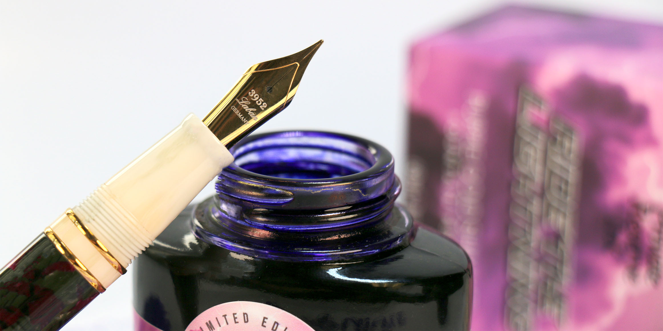
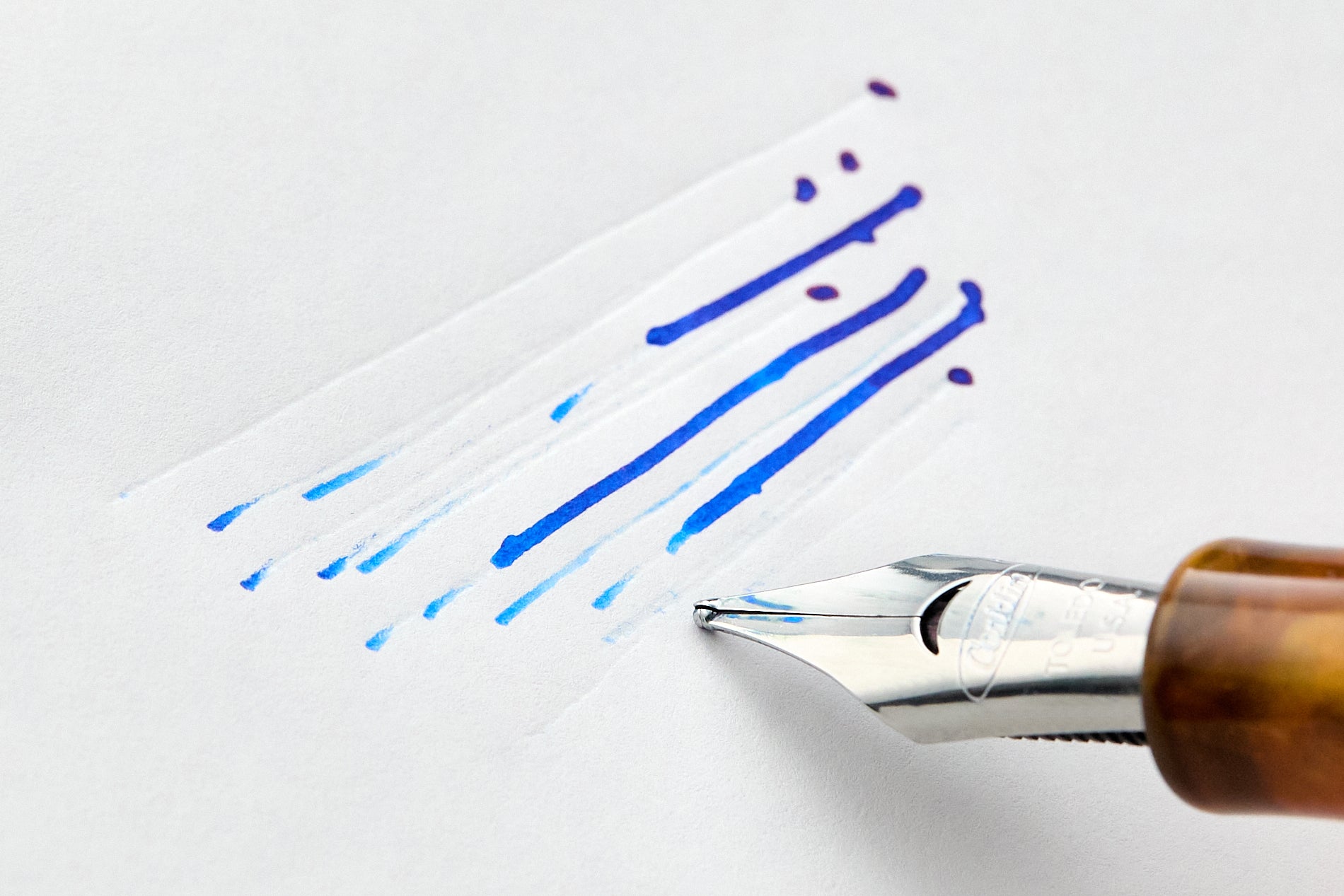

Once you've absorbed a few buyer guides and reviews, you quickly learn that the nib—not the barrel or the brand—is the soul of a fountain pen, and that smoothness is a multi-factor obsession, not a given. The Goulet Pens Fountain Pen 101 series breaks down the nib as the single most important element for writing feel, while Pen Chalet's expert advice insists that smoothness is more about tuning, tipping alignment, and ink flow than about gold versus steel. JetPens' guides drill into the specifics: fine nibs are the best everyday choice for beginners because they suit ordinary copy paper and produce lines comparable to a gel pen, and they recommend Pilot Iroshizuku ink as the gold standard for reliability and easy cleaning. Trouble-shooting sources from both Goulet and JetPens emphasize that a scratchy nib is almost always fixable by checking tine alignment with a loupe, not by replacing the pen. And the ink-test obsession? JetPens' beginner ink guide names Pilot Iroshizuku as the most 'well-behaved' option, with Waterman as the budget-friendly alternative that offers more ink per dollar in cleverly designed bottles that can rest on their sides for easy filling. The real takeaway for a curious hobbyist is that a $30 pen with a well-tuned steel nib and an Iroshizuku ink cartridge can outperform a $300 pen that's been poorly set up.
+Field notes
- —Nib smoothness depends far more on tuning, tine alignment, and ink flow than on the metal (gold vs steel), and a properly tuned modern steel nib can feel just as smooth as gold.
- —For beginners, USA-based retailer JetPens recommends starting with a fine nib because it produces line widths similar to a ballpoint or gel pen, dries quickly, and performs better on ordinary copy paper than broader nibs.
- —The most common cause of a scratchy nib is misaligned tines—one tine sitting higher or lower than the other—which can be corrected by gently pressing the nib tip against a hard surface and rocking it side to side; a loupe is essential for diagnosing this.
- —Pilot Iroshizuku inks are widely considered the most 'well-behaved' fountain pen inks for their smooth flow and easy cleanup (though they are not waterproof), making them the top recommendation for anyone new to the hobby.
- —Waterman ink offers a budget-friendly alternative that is equally well-behaved, comes in both standard international long and short cartridges, and features a uniquely designed bottle that can rest on its side for easy filling as the ink level drops.
- —Goulet Pens emphasizes that a scratchy nib is almost never a lost cause: their first troubleshooting step is to clean the pen thoroughly, then systematically test different inks, converters, and papers before assuming the nib is defective.
Keep exploring
More of Fountain Pens
More to explore
In the same world.

Sailor Fountain Pens
Sailor’s fountain-pen world is built around a few core families that collectors quickly learn to recognize: the rounded…

Vintage Pelikan Fountain Pens
Vintage Pelikan collecting really starts with the Model 100, the company’s first fountain pen, made from 1929 to 1944 an…

OHTO Fountain Pens
OHTO’s fountain-pen line is a compact corner of Japanese pen culture built around metal-bodied, fine-nib everyday writer…
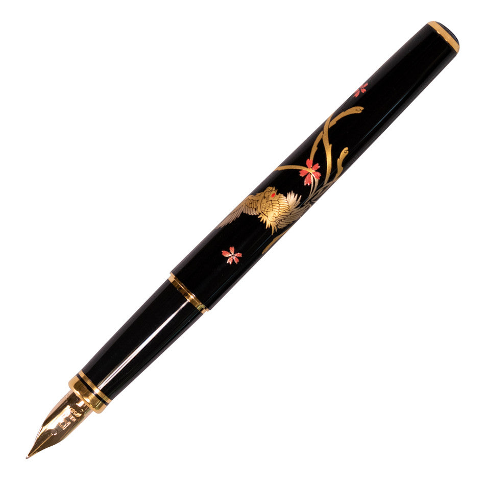
Platinum Modern Maki-e Fountain Pens
Platinum’s Modern Maki-e pens sit in a very specific corner of fountain-pen collecting: Japanese motif pens made with a…
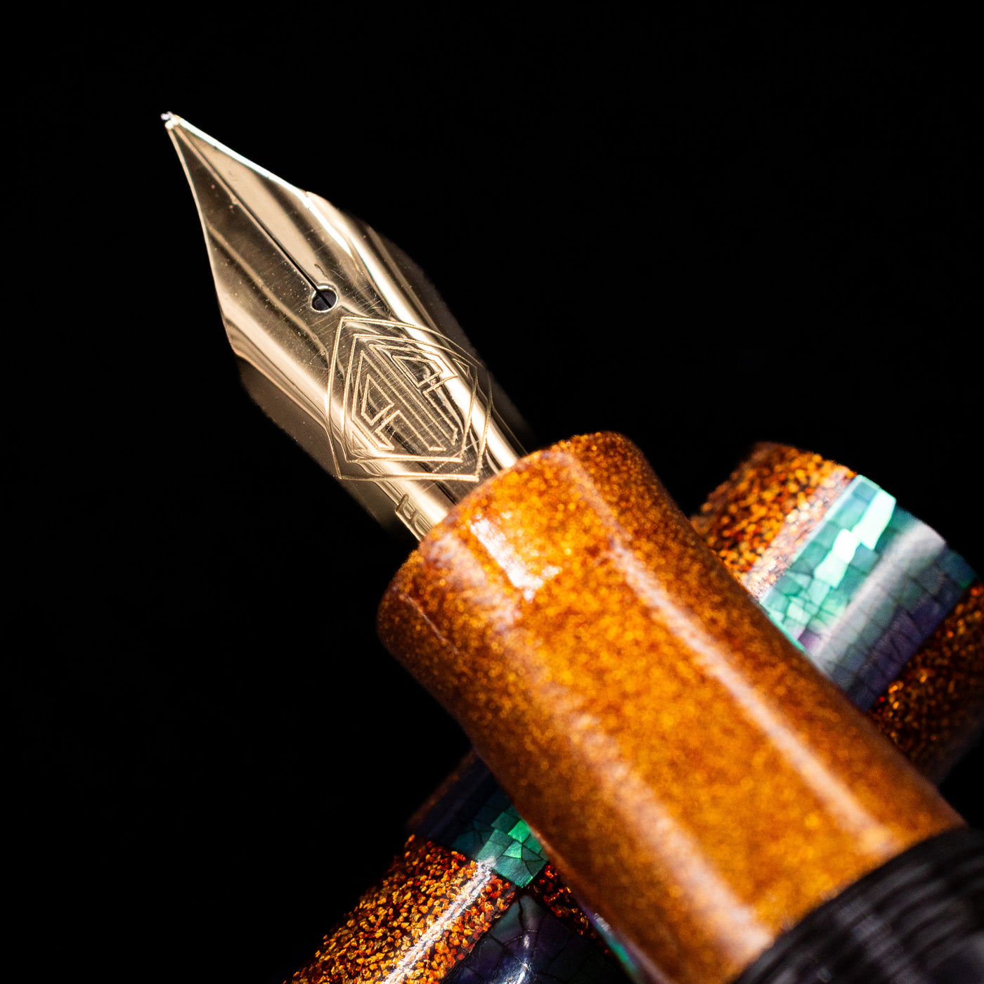
Sailor Maki-e Fountain Pens
Sailor’s Maki-e fountain pens sit at the meeting point of writing instrument collecting and a Japanese decorative art wi…
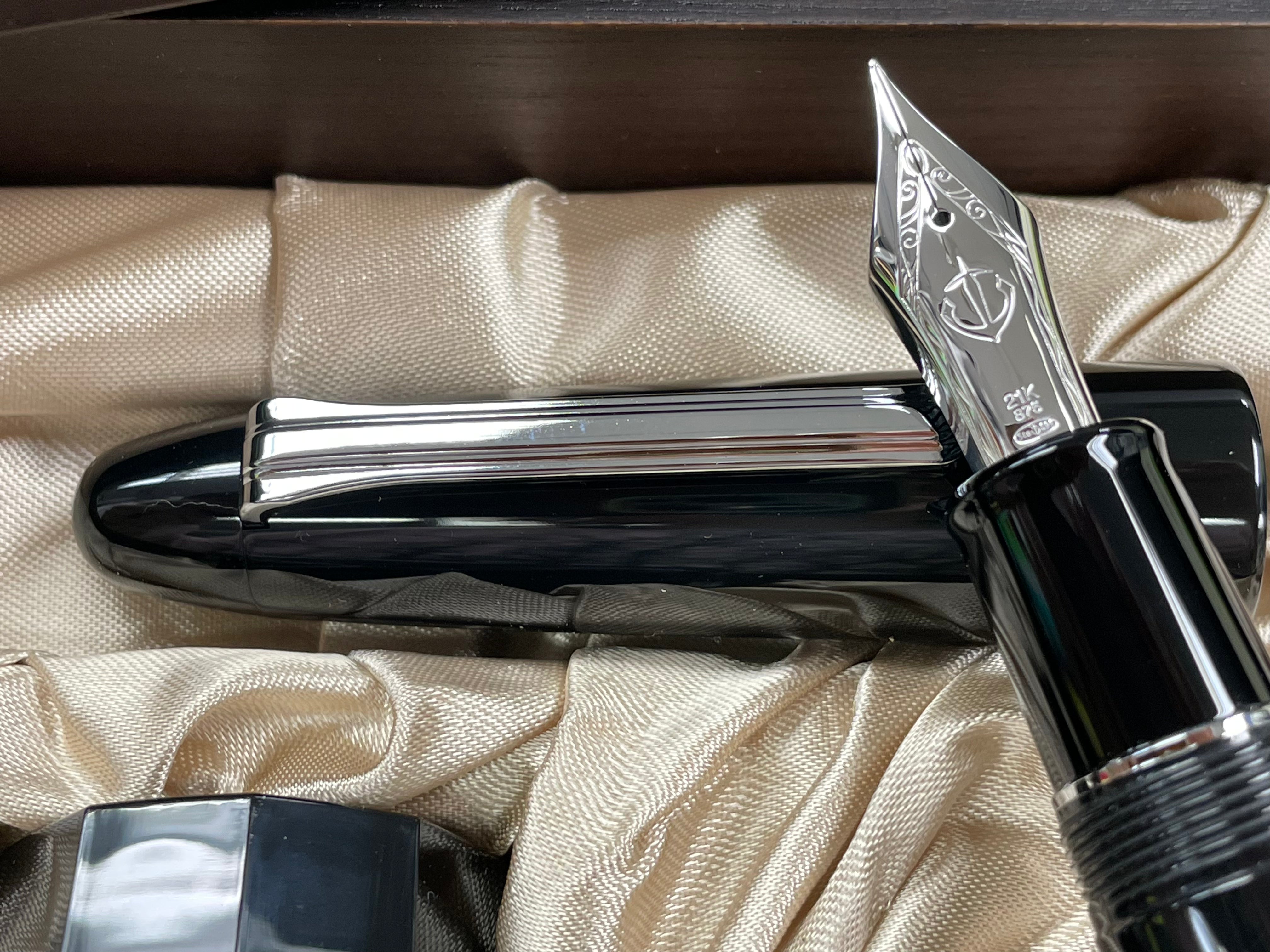
Sailor King of Pens
Sailor’s King of Pens is the company’s top-of-the-range fountain pen line, positioned by Sailor as a symbol of its techn…
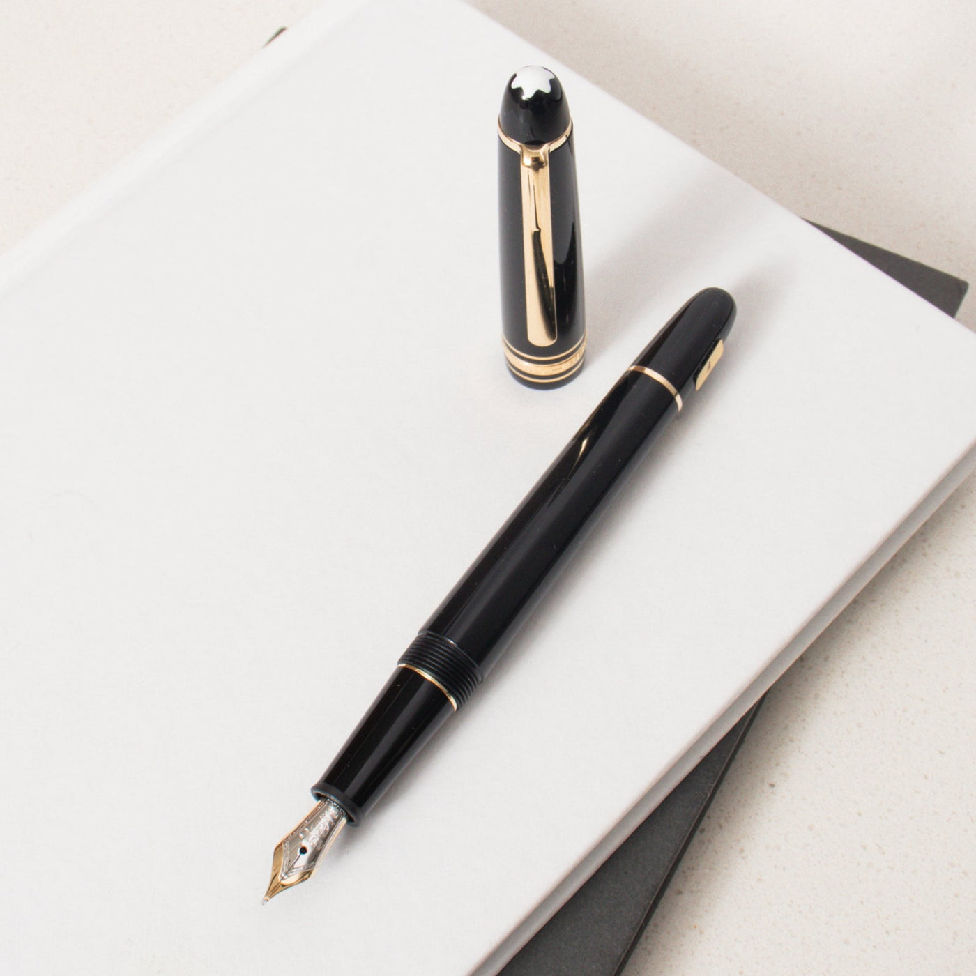
Montblanc Meisterstück 149
The Montblanc Meisterstück 149 is the flagship oversize fountain pen in the brand’s Meisterstück line, sold today in bla…
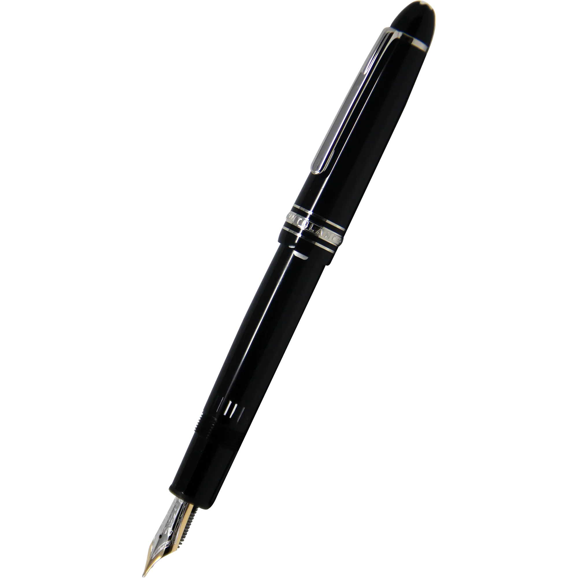
Montblanc Meisterstück LeGrand
Montblanc’s Meisterstück LeGrand is a mid-to-large format within the brand’s core writing line, offered across fountain…
More in Fountain Pens & Writing
Stay in this world.
Sailor Fountain Pens
Vintage Pelikan Fountain Pens
Platinum Modern Maki-e Fountain Pens
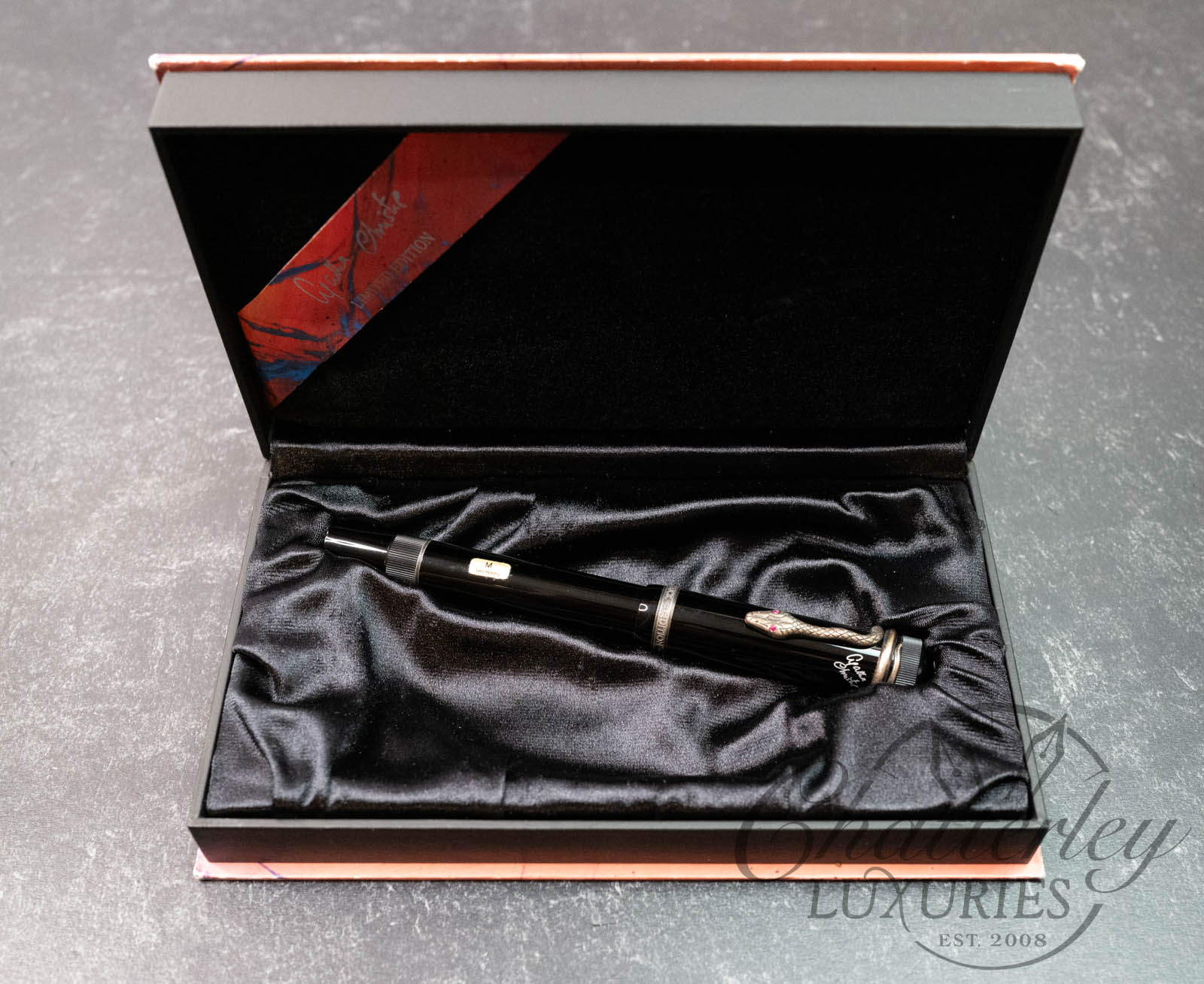
Montblanc Writers Edition Agatha Christie
Sailor Maki-e Fountain Pens
Montblanc Meisterstück 149
OHTO Fountain Pens
Sailor King of Pens
Imagery
Know someone who’d love this?
Discovered by ArcurianAuto-generated from public sources and AI synthesis — it may be incomplete or inaccurate. Treat it as a starting point for your own exploration, not professional (medical, legal, financial, or safety) advice. Verify anything you act on. Report this page.